It was another busy and creative spring wedding season here at Dodeline, and we are loving receiving wedding invitation images every few days from our clients’ nuptials. Below we’re sharing a few highlights from this past wedding season, although to be honest it was really hard to narrow it down to these. Look for a part two next month!
Magnolia Carriage House Wedding Invitations

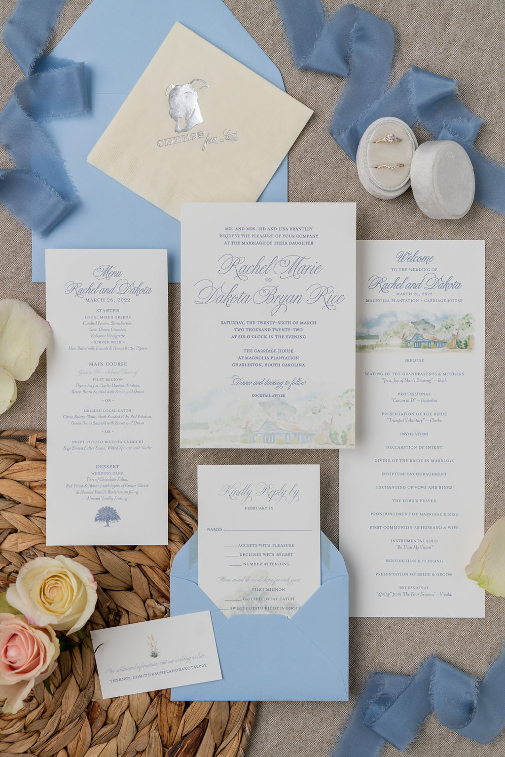
This client came to us with a specific vision: she wanted to feature the Carriage House in a soft, subtle illustration at the bottom of the invitation. The wedding palette mostly centered on a lovely shade of blue, so we used that for the letterpress ink in combination with the digitally (flat) printed custom illustration.
A majestic oak tree dripping in Spanish moss appears in the background on the response card, while a little touch of pampas grass finishes off the website card nicely.
Once we got to the day of paper, we reused the illustration of the Carriage House on the wedding program and designed an elegant menu in the same blue ink color. The couple’s dog, Lexi, is a fun surprise on the cocktail napkins!
Floral Seabrook Island Wedding Invitations

Lavender and blue are a gorgeous combination for this March wedding on Seabrook Island. Watercolor florals grace each piece, and a subtle watercolor wash in the envelope liner rounds it all out.
Classic Belfair Wedding Invitations

These custom wedding invitations for a Belfair event are elegance itself! Black letterpress on a chardonnay backing with dusty blue accents. Everything is held together with a frayed edge silk ribbon and finished with a custom wax seal.
River House Wedding
This wedding welcome sign was one of our favorites of the season, featuring the River House illustration that also appeared on the invitation.

Custom Thomas Bennett House Invitations

Blue + blush is the perfect color scheme for a spring affair. These custom wedding invitations featured a beautiful blue wedding monogram/crest that was implemented in multiple places to really tie the design together. It was featured on the save the date, the wedding invitation, and more. We especially love the style of the map in this suite, with the white space and blue providing a nice backdrop for the colorful icons. Everything was tied together with a frayed edge blush ribbon.
Legare Waring House Invitation Suite
This suite pretty much takes the cake for spring season ’22!

A lot of times with these flat lay photos, as much as we love them, you really can’t get an accurate idea of how much labor and care went into making everything. So for this suite, we thought we’d illustrate what’s going on!
- The invitation is 1 Color Letterpress + 1 Color Gold Foil (so goes through 2 machines to print it)
- The response card, details card, and website card are all flat printed. There were multiple versions of each card though and different guests received different information (i.e. invited to different events).
- The shimmery opal pocket has a custom gold monogram added to it which was cut out of foil, “weeded,” transferred and then ultimately stuck in place to the pocket.
- The pocket also has a shimmery pale blush stock adhered to the middle, done by hand.
- The invitation was left loose but placed over the blush in the middle of the pocket, with the vellum overlay over the top of it.
- All the other cards, response envelope included, were tucked into the pocket on the right in size order and in varying combinations depending on who was to receive what.
- The custom Legare Waring House envelope liner was printed, cut, and glued inside the envelopes.
- Once the pockets were stuffed, they were folded up and a flat ribbon piece was wrapped around them. Then a second piece was cut and twisted around it and stuck in place with the wax seal.
- Then the package went into the envelopes, which had been printed with guest addresses, and were ready to seal + stamp.
Phew! It’s a lot more work than those pretty flat lay photos lead you to believe sometimes. It was well worth it though to have happy clients…

William Aiken House Vow Renewal Invitation
And one more to share before we sign off for today – we don’t just do weddings, we can also do vow renewals! Mac and Amy did it right – they had always wanted to have a Charleston wedding, but decided in the end to get married locally in Georgia. So now for a big anniversary they decided to plan the wedding they had originally wanted. How cool is that?!

The custom wedding invitations we created for them are full of classic and beautiful details. From the William Aiken House gate wax seals to the shiny gold champagne glasses, nothing was overlooked. The liner features a soft, one color illustration of the part of the William Aiken House courtyard where they were holding their ceremony. The invitation is letterpress in a lovely matte gold/tan color and the other pieces coordinate perfectly.
Here’s a closeup of the map that was included just for fun…

What better way to get your guests excited than a wedding watercolor map of Charleston?
In Conclusion
It’s been a busy spring season around here and these invitations represent only a handful of the wedding paper we’ve been creating. Stay tuned for part two, and if you’re currently planning your big day, we’d love to chat with you! Reach out to us anytime.


Leave a Reply