Color Associations
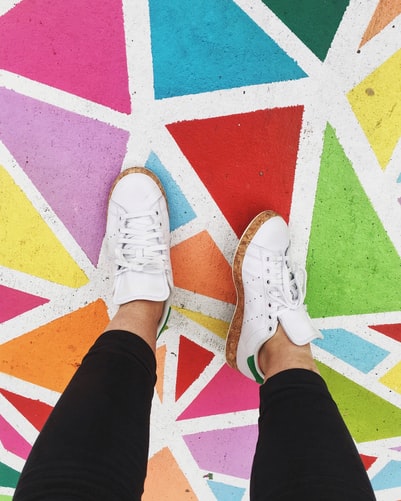
When looking at using color psychology in a positive manner within a business setting, the number one thing that is taught on a base level is that certain colors evoke specific psycho-emotional responses. Understanding these responses and what colors trigger each emotion can help you to greatly change how your site is perceived.
The color blue, for example, is a great option if you are looking to cultivate trust. It exudes professionalism due to its ties to corporate level imagery and is often used in art and text pieces to create a feeling of safety and peace. However, if you want to call someone to action, using bright, vivid colors will make readers feel excited and interested in what you have to say, as it is eye catching and bold.
Looking for a Quality Web Designer?

Let’s take a look at some examples of subtle ways color psychology can play into your site.
Use Yellow for Excitement
If you look at things that are typically yellow, you will notice a lot of cautionary signs and devices feature the color heavily. Things like caution street signs, caution tape for crime scenes, and even hard hats all use the color to remind people to be careful. On the flip side, it is also used for exciting, whimsical designs, as well. You often see yellow on things like roller coasters and games. This is because it is a dual usage color that triggers excitement and immediate interest.
Going Green
It makes sense that green is typically used with natural products or nature-themed websites. This is because when we think of nature as a whole, we often imagine green grass, trees, and bushes. Plants are even often referred to as “greenery” because of this association. Due to this, using green on naturalist sites will usually give you a much stronger sense of credibility on the topic by association alone.
These are just two examples, but they give an overall view of what can be said without any words at all just from properly using color psychology to enhance your site.
Creating a Conversation
When you are looking to successfully utilize color psychology online, you want to create a conversation with your reader. Color can be used to set the tone and create an appropriate venue for whatever you are trying to convey. For example, you will notice that a lot of legal offices use colors like black, dark brown, and gold, as they showcase professionalism and luxury. Car dealerships use either red as a “hunger”-inducing color to entice purchases, often alongside blue, which generates a feeling of trust.
This ability to carefully curate the colors of a website and even of specific pages increases chances of successfully making a sale or connection. When visitors feel on a psychological level what you are trying to convey, they are more likely to trust you and be receptive of your overall message.
How We Can Help
If you are looking for your best company option of web design in Charleston, SC, Dodeline Design is here to help! As professionals in the industry, we strive to create high-quality sites that use color psychology among other techniques to create a cohesive and comfortable experience for all visitors and viewers of the site. Let us help you create something amazing by filling out our form!


Leave a Reply